Do you know how powerful the data is, Today?
Are you already aware of how to manage your data using Google Data Studio? If not then definitely this guide will help you to get started.

Managing your report of data never seems to be an easy task.
As your business grows, and the number of clients continues to increase, so does the sophistication of your client reporting needs.
Are tired of spending hours updating the same spreadsheets each month?
And you are spending more time on doing rather than on analyzing.
Then, of course, you would want to find a better way to analyze and report your data, right?
If so, you don’t need to get worried now. Google Data Studio will solve all your problems.
Are you ready to take your data visualization to the next level? Then let’s get started.
What is Google Data Studio?
Google Data Studio is a great, free data visualization tool that helps you to create interactive dashboards, customize, and gives beautiful reporting.
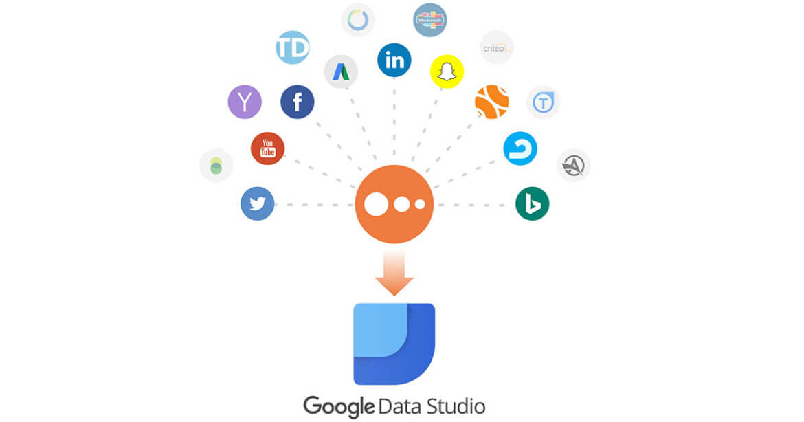
It syncs all your data sources into one reporting experience.
What are the areas to ensure Google Data Studio Success Report?
There are few key areas to ensure your Google Data Studio Report is a success. They are:
• Choosing a template.
• Connecting data sources.
• Choosing metrics that matter.
• Sharing reports.
Choosing a Template
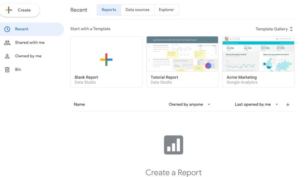
Firstly you have to choose a template.
Google Data Studio provides you a different variety of templates to get you started.
If you are new to the data studio, it is important for you to choose a template based on the type of data you are using.

With any type of template, you will get the ability to customize items and fonts to create a more consistent report.
You can add multiple pages to your report.
As we know every client has different needs and their reporting should also be different.
The most efficient route is to create templates specific to SEO, PPC, and paid social.
Connecting Data Sources
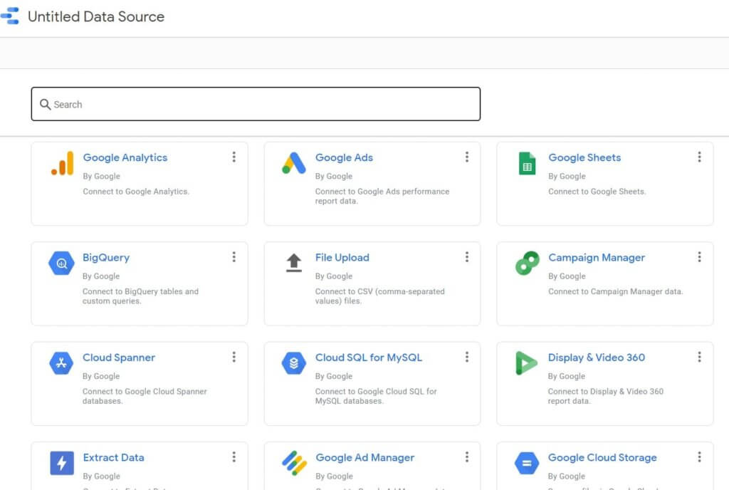
To build your report successfully, you have to connect data sources.

There are a number of connectors available in Google Data Studio.
Connectors help to take the manual tasks and syncs all data for you.
You can also choose to add data sources at the starting of your report or you can add them later on.
As mentioned above there are also third-party connectors that can pull in additional data.
Choosing Metrics That Matter
Let’s be real, the worst part is when clients open reports and see a complete data dump.
Google Data Studio is completely customizable.
Do your client care about ROAS (Return On Advertising Spend)? You have to be sure to include metrics such as spend and revenue.
You have to include proper metrics and insights based on goals so that clients will be sure that you are listening to them.
Sharing Reports
Whenever you are ready to share reports with clients, be sure to review the settings.
The following options are available for sharing.
Invite by email
The client must have a Google Account associated with email.
Clients are allowed to “view” or “edit” reports.
Anyone who has a report link can view that report.
And you know Google added another interesting feature- beta, was the options that limit sharing in the below options:
- To prevent editors from changing access and adding new people.
- It also includes features to disable downloading, printing, and copying for viewers.
How to Build and Edit a report
Now it’s time to create your first report!
You can dictate the time-frame of every dashboard, either individually or at the report level.
Choosing Proper Visuals
The first step you have to do is to select the data visualization you want to use.
By clicking “Insert”, you will be able to choose from a vast selection.
These include:
- Scorecard
- Time Series
- Tables
- Pie Chart
Scorecard
This data shows a single metric taken from a data source.
Based on the source, you will get to choose many options.
In that case, the template shows three different scorecard metrics:
- Clicks
- CTR
- Impression
Time Series
The visualization here shows the changes that occur in Clicks and CTR over a set period of time.
Tables
The table is a common visualization used in reporting dashboards.
It allows you to drill down to campaigns, ads and also customize the metrics that are shown within the table
Pie Chart
It is another tool to showcase comparisons between data points.
Editing Data Formats
The ability to choose the look and feel of a report is a great impression for clients.
It helps to make consistency.
In order to edit the format and style of visualization, you have to select the chart.
What are the few ways to personalize Scorecard?
• Font and background color.
• Changing comparison metric colors.
• Text padding to align either left, center,
•, or right.
Adding Report Filters
You can easily group multiple visualizations together in an efficient way by adding reports and page filters.
Final Thoughts:

Hopefully, the above-mentioned guideline to google data studio helps you to feel more confident in creating personalized reports for your clients and brands.


